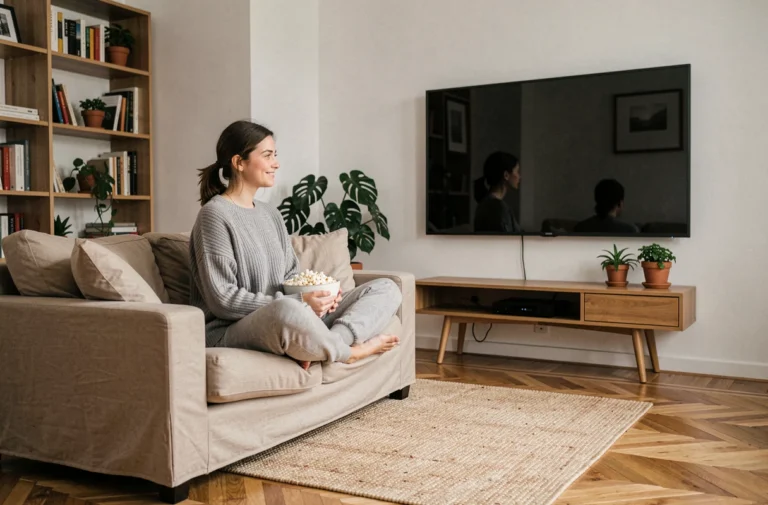
Arranging a room is not just about choosing a sofa and a wall color. Every decision, from the flooring to the type of lighting, changes how you experience the space on a daily basis. Decorating your home with style starts with understanding how materials, light, and proportions interact, and then making consistent choices rather than accumulating trends.
Indoor air quality and decoration choices: a often overlooked criterion
Have you ever noticed a lingering smell after installing new flooring or repainting a wall? These are volatile organic compounds (VOCs) that are released into the air of your home. In France, the relevant construction and decoration products (paints, varnishes, adhesives, flooring) carry an emissions label rated from A+ to C. A+ means very low emissions, while C indicates a high level.
This rating significantly changes the way you choose paint or flooring. Before comparing shades, check the label on the packaging. A matte paint rated A+ and another rated B may offer the same finish, but the former contributes to healthier indoor air, especially in a poorly ventilated bedroom or living room.
This reflex also applies to the adhesives used to fix soft flooring or wallpaper. We often think about color and texture in wall decoration, but rarely about what the product emits once applied. Consulting this label before purchase adds a concrete health criterion to your design choices without extra cost. Resources like the site tropheesdelamaison.com allow you to explore different approaches to reconcile style and practical requirements in every room of the house.
Colors and proportions: adapting the palette to the geometry of the room
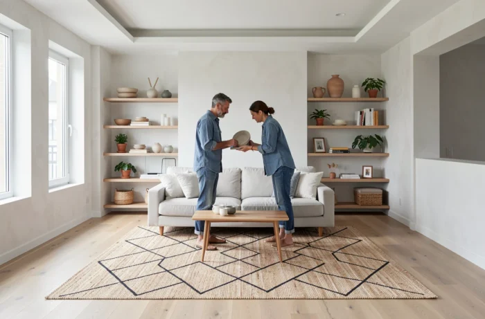
Applying a dark color in a small living room does not produce the same effect as in a spacious reception room. The link between color and perception of space is based on a simple principle: light shades reflect more light and create a sense of openness, while saturated tones visually bring the walls closer together.
The accent wall to restructure a space
Rather than painting four walls in the same shade, one accent wall changes the perceived depth of a room. A back wall painted in a deeper tone (forest green, midnight blue, terracotta) draws the eye and creates a focal point. The other three walls remain in a neutral tone. This contrast is enough to give character to a living room or bedroom without visually reducing the space.
A common mistake is choosing the accent color based on a tiny sample in the store. A square of a few centimeters does not reflect the final result. Always test the shade on a wall section of at least one square meter, and observe it at different times, as the natural light in the morning and evening radically changes the perception of the tone.
Harmonizing floor, walls, and furniture
A coherent interior generally works with a maximum of three colors: a dominant (walls and floor), a secondary (main furniture), and an accent (cushions, frames, decorative objects). This rule is not rigid, but it avoids visual overload that can tire the eye, especially in small spaces.
For a living room with light oak flooring, off-white walls, and an anthracite gray sofa, the accent can come from ochre or mustard textiles. Cohesion arises from the discreet repetition of this third color on two or three elements scattered throughout the room.
Layered lighting: the technique that transforms the atmosphere of a living room
A single ceiling light in the center of the room produces flat and unflattering light. Professional decorators work with layers of lighting, and this principle can be adapted to any budget.
- General lighting (ceiling light, pendant) provides the basic brightness. It is not enough to create an ambiance, but it makes the room functional.
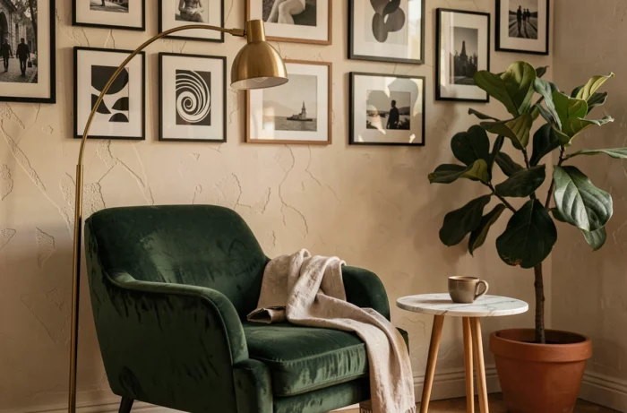
- Task lighting (table lamp, reading lamp, floor lamp) creates areas of softer light. Placed near an armchair or on a console, it visually divides the space into distinct corners.
- Accent lighting (spotlights, LED strips behind furniture) highlights a painting, a shelf, or a niche. This layer adds depth and relief to your decoration.
Layering these three types of lighting in a living room or bedroom radically changes the atmosphere without touching the furniture or walls. Vary the color temperatures: warm light (around 2700 kelvins) is suitable for relaxation spaces, while a more neutral light works better in an office or kitchen.
Thermal comfort and interior design: thinking beyond aesthetics
Summer comfort becomes a parameter to integrate from the planning phase. An analysis of around 700,000 energy audits of individual homes, reported by Modes & Travaux in October 2026, indicates that some renovations can reduce summer comfort while improving winter insulation. Insulating without planning for solar protection or adequate ventilation risks turning a south-facing living room into a sauna.
In practical terms, this means that the choice of your curtains, blinds, or shutters is not just decorative. A thick linen curtain in front of a south-facing bay window filters light and limits temperature rise. An exterior blind (awning, roller shutter) is even more effective than an interior curtain, as it blocks heat before it passes through the glazing.
Before insulating attics or changing windows, examine the type of construction, existing solar protections, and the mode of ventilation. Treating energy performance as the sole objective can degrade daily comfort in summer, which directly impacts how you live in each room.
Ultimately, decorating and arranging your home with style is about articulating three dimensions: what you see (colors, proportions, light), what you breathe (air quality, material choices), and what you physically feel (temperature, ventilation). A successful interior depends as much on these subtle trade-offs as on the choice of a beautiful sofa.